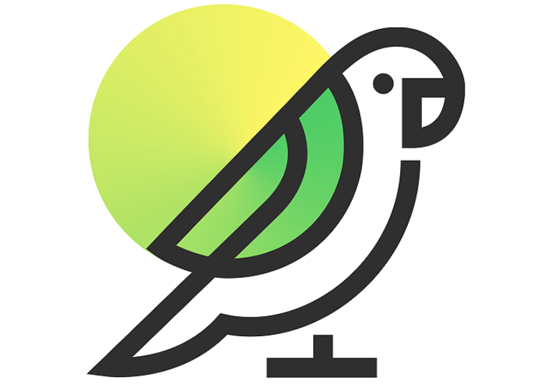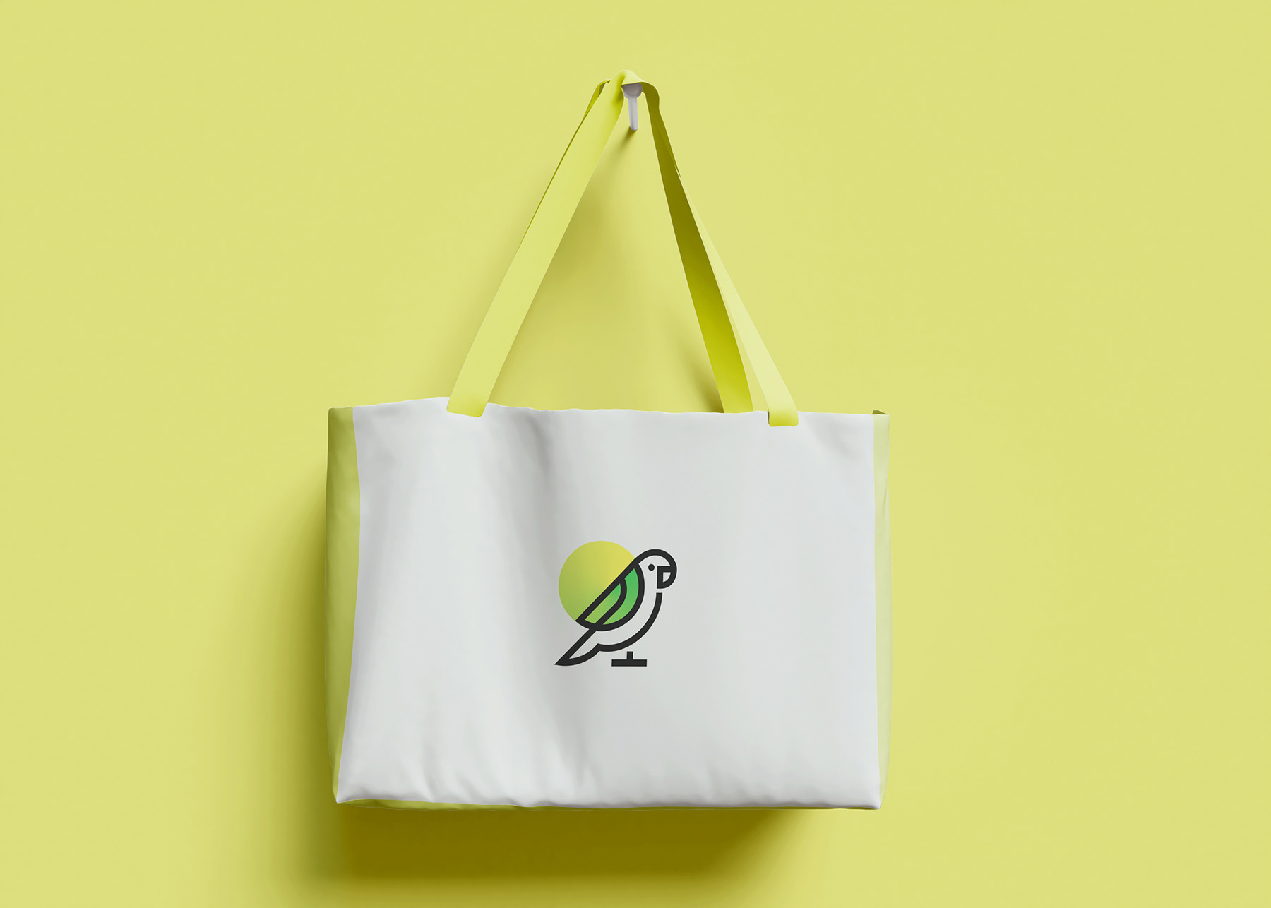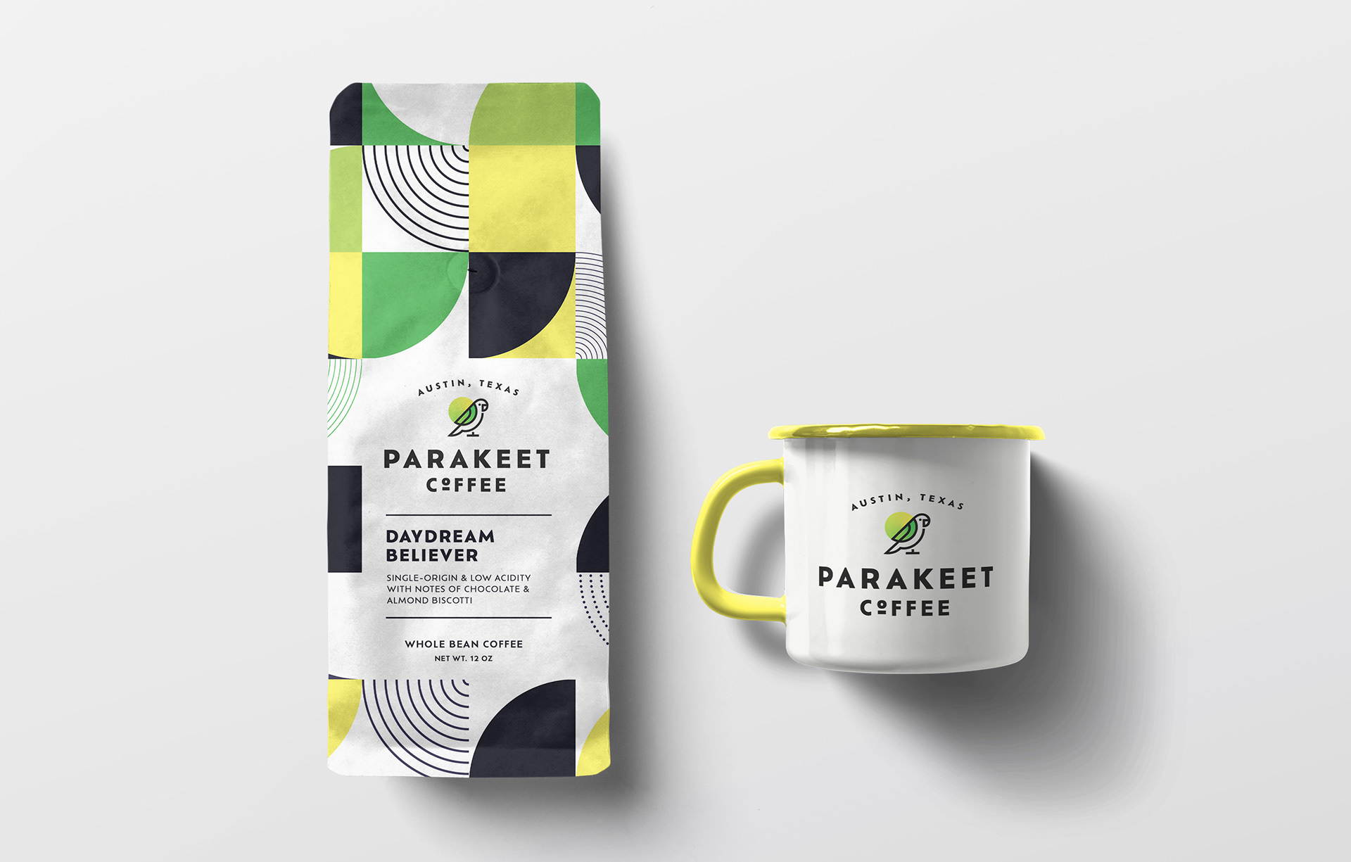
When designing the logo for Parakeet Coffee, the client requested something vibrant, welcoming, and simple yet bold. I began by focusing on the parakeet as a central symbol, since the bird naturally conveys friendliness, warmth, and a lively atmosphere—qualities that align with the café’s identity.
To achieve a clean yet striking look, I used thick, confident linework to outline the parakeet, giving it an approachable and modern feel. The simplified shapes ensure the logo remains versatile across applications, from signage to coffee cups, while still being instantly recognizable.
For the color palette, I incorporated a fresh gradient of greens and yellows. The green represents growth, freshness, and the organic nature of coffee, while the yellow radiates warmth and positivity, reminiscent of a morning sunrise. The circular sun-like background reinforces the feeling of energy and renewal—echoing the experience of that first sip of coffee.
The result is a logo that’s playful but professional, capturing the vibrancy of a parakeet and the inviting spirit of Parakeet Coffee. It balances simplicity with boldness, making it both approachable for customers and adaptable across brand touchpoints.