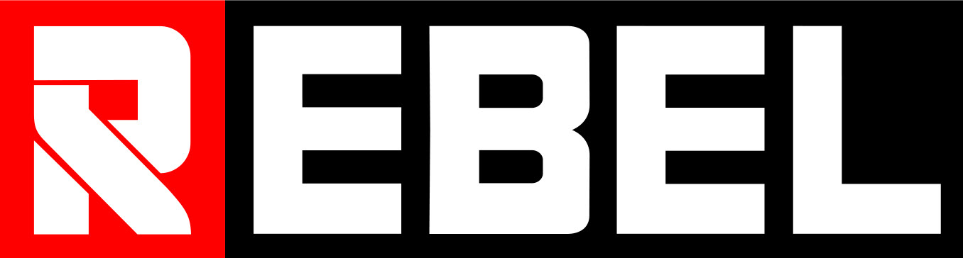
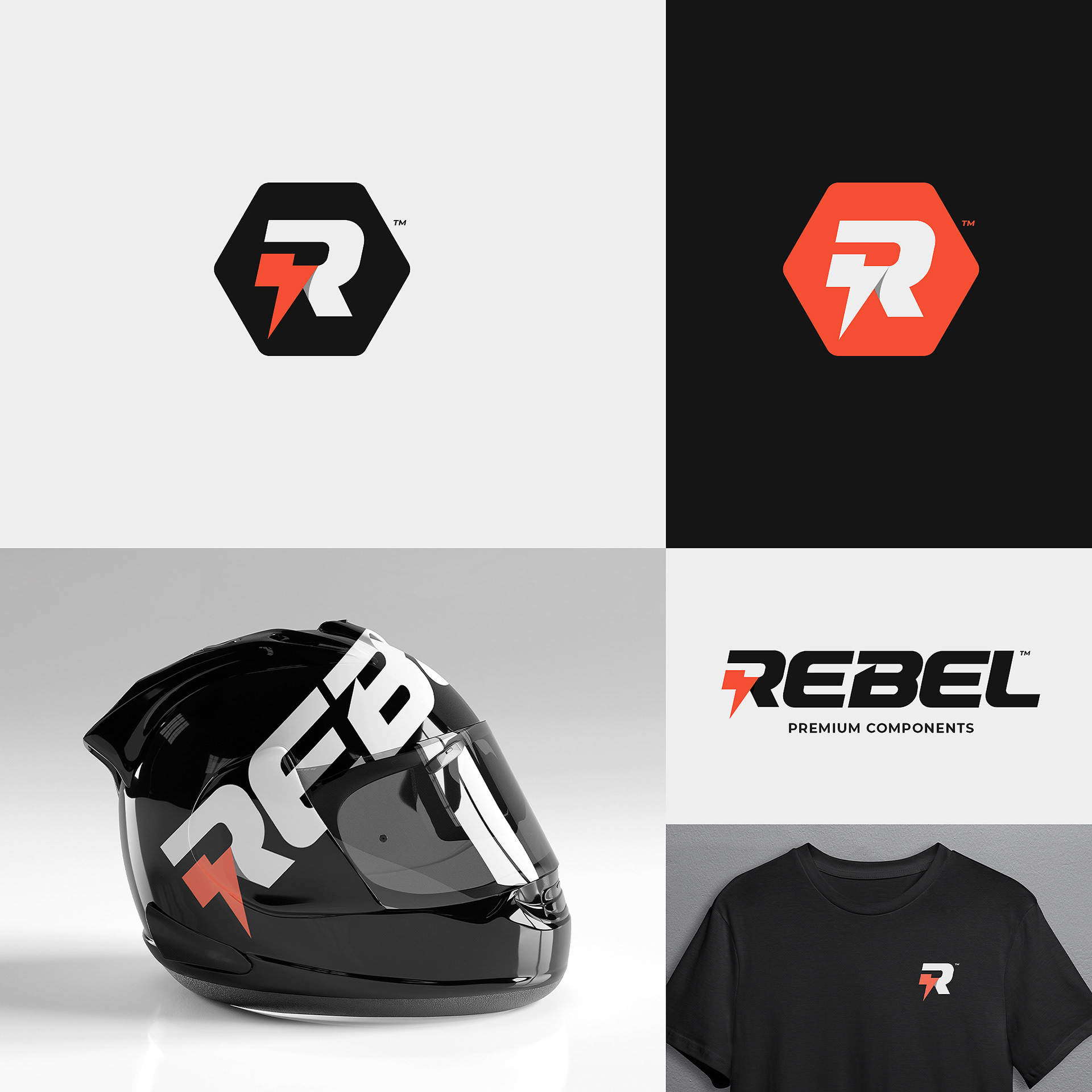
Overview
Rebel Premium Components is a high-end motorsport and racing accessories manufacturer which distributes world-wide. The client was looking to evolve their current logo with a strong, masculine word mark and accompanying logo mark, each of which could be memorable as standalone or combined; something that people not only would want to feature on their motorbikes or cars but also a mark that they'd want to wear with t-shirts, hoodies, and other apparel.
For this redesign, I decided to keep the fundamental structure of the original logo, which would allow the "R" to be a strong mark as a standalone element or as part of the word mark. The client liked the idea of incorporating a lightning bolt somewhere in the design. I chose a cleaner typography which was strong and had a sense of motion, and used the silhouette of the "R" to carve in a lightning bolt. A subtle shadow helped to separate the bolt from the letter, adding dimension and interest to the overall design.