Background
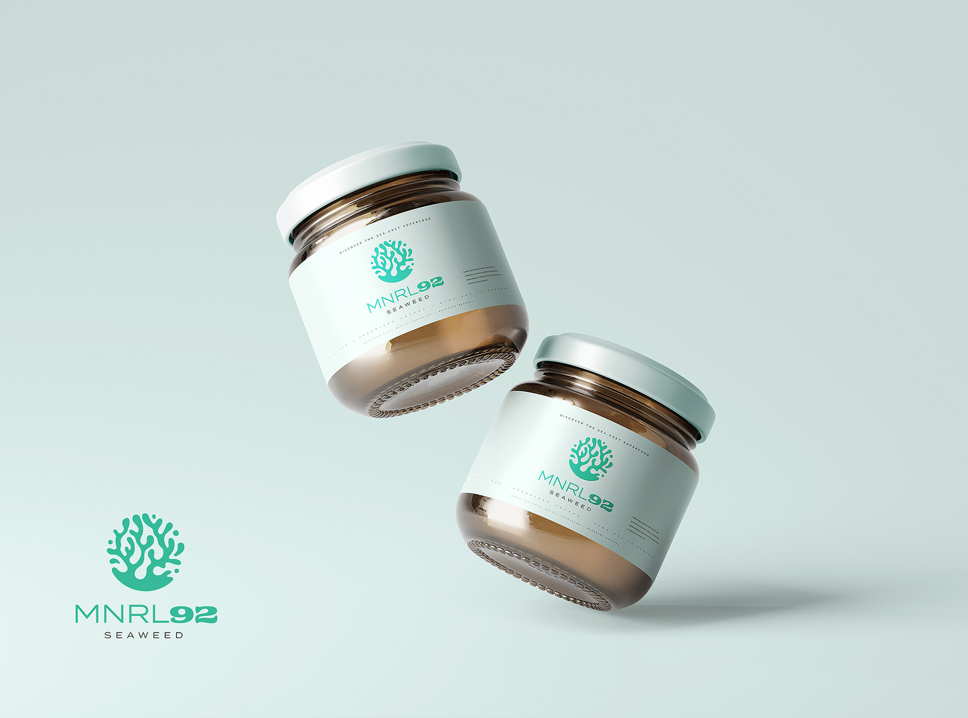
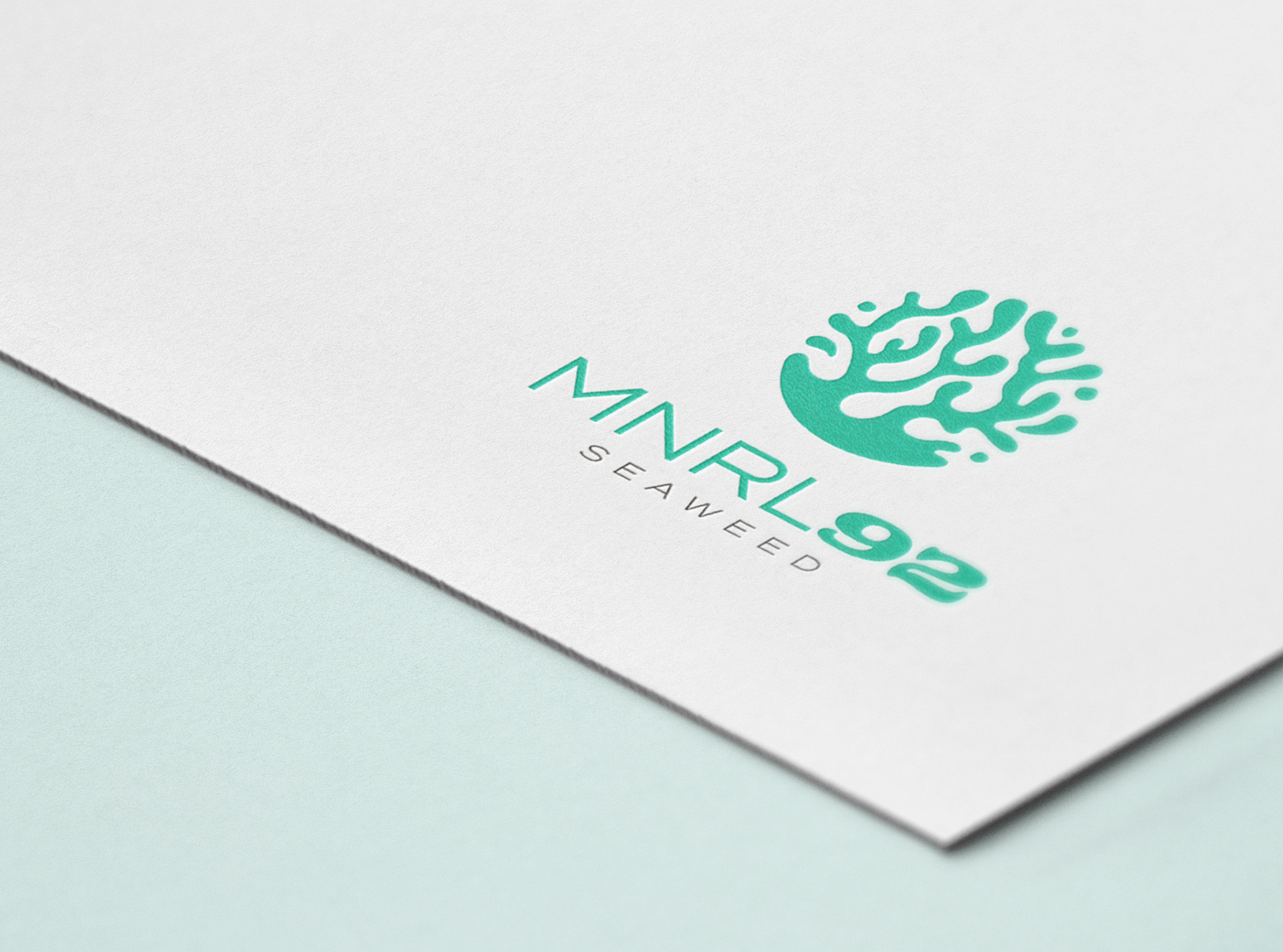
MNRL92 is a nutritional supplement producer that is driven to provide the highest quality seamoss to the market. Their name is derived from the 92 essential minerals found in the superfood. Their target audience are those who are health conscious, or are seeking alternative options to conventional pharmaceuticals.
The Challenge
MNRL92 sought a logo and accompanying packaging design that was sophisticated yet playful which would connect with their target audience.
The Solution
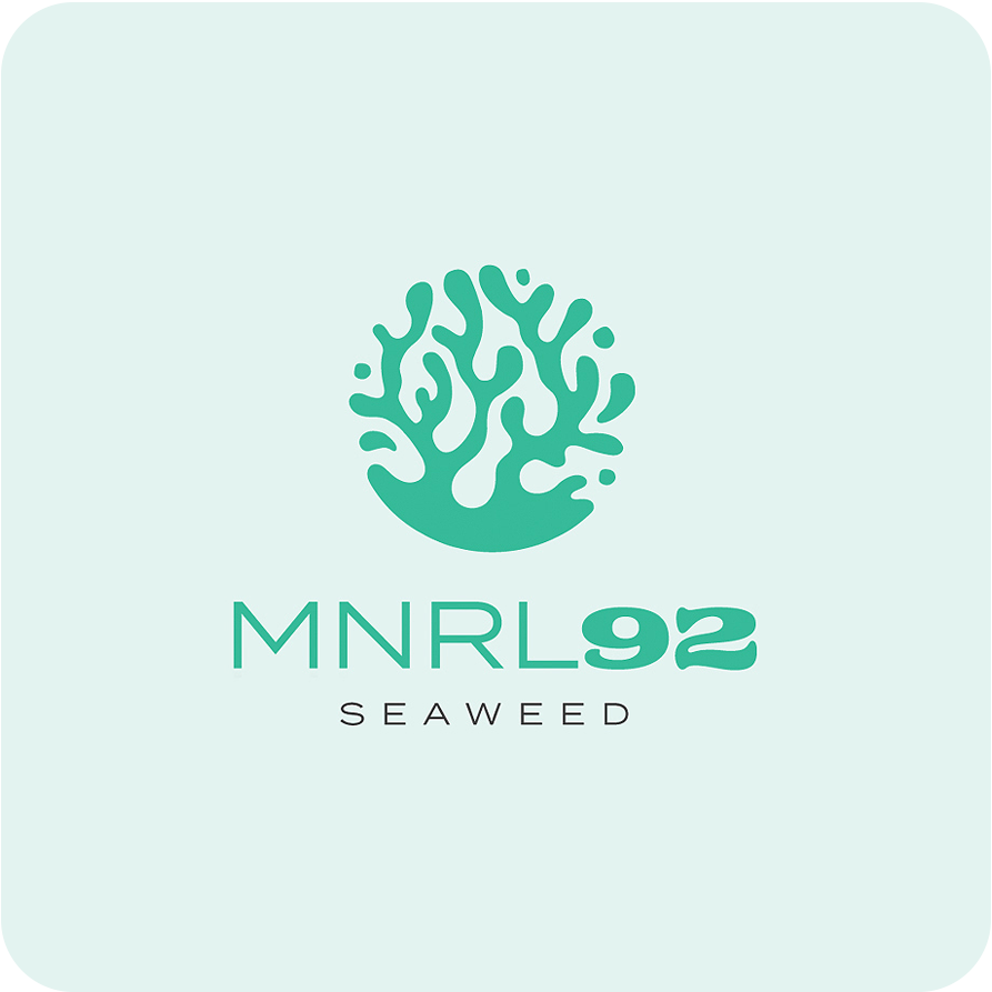
Through a number of sketches and referencing imagery of seaweed in its natural environment, the objective was to capture the imperfect, undulating silhouette of seaweed underneath the ocean. A circular frame formed by the deliberately imperfect shapes creates an airy yet harmonious mark.
A combination of typography was chosen to create a balance between modern and organic. Termina coupled with Freehouse for the "92" plays off of the organic logo mark, and juxtaposes modern and organic styles with tasteful restraint.